
Austria
The home jersey is nothing special while the away jersey has a rather lovely decorative feather pattern.
It does not say much but is very 80s.
But what does the feathers really have to do with Austria?
Belgium
Very interesting home sweater!
Here is a decorative effect with a wide brushstroke over the sweater that will form a B. Nice and fast.
But again - what is the connection to Belgium?
Are they major manufacturers of brushes and paints?
In that case, I missed it.
Croatia
The checkered home jersey is, as usual, very nice.
Too bad the pattern does not follow on the back, which would have been more fully cast.
The away jersey is an unimaginative black game with the checkered pattern.
Czech Republic
The away jersey oozes ruffled, strong lime-colored sweater with a herringbone pattern.
Modern, fast and stylish look that stands out.
Denmark
The home sweater is traditional.
But funny that the pattern at the bottom is based on a sound wave that occurred when the Danish fans sang the national anthem.
Good anchoring in the team and the country.
England
The home sweater is very nice.
The shield is in the middle and the logo is below.
Good solution because the shield is most important.
The stripes on the away shirt are: well, why then?
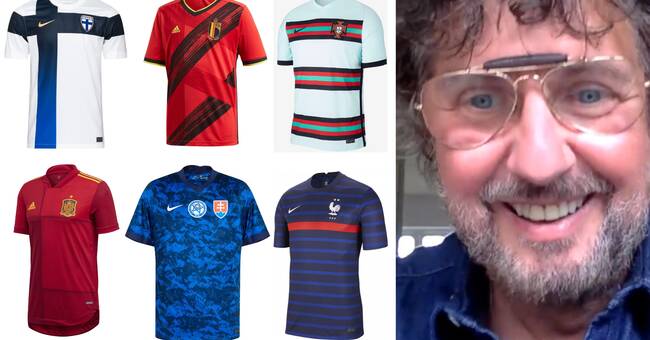
Finland
I like the home sweater a lot and it's not just because I'm half-finned.
The decorative effect is an 80's classic where the color is toned from dark blue to royal blue.
The cross is graphic and clear.
But the away shirt is reminiscent of a uniform for someone who works in a supermarket, such as Walmart.
Sad!
Does not feel like a football shirt.
France
The home jersey tries to give feedback to the successful team 98 with the red ribbon on the chest.
Quite nice!
But above all, I like the rooster on the chest!
The away shirt is incredibly stylish and classic.
The rooster comes out even more!
It's a real rooster like crazy - a clear connection to the national symbol.
Germany
The parallel lines are really inside.
80s but maybe a little rugby.
The away shirt is sad, the same strange cut across the chest that Sweden has.
What did you want to say with it?
Hungary
Hungary has chosen a cool decorative effect: a line that sweeps across the front and symbolizes the river Danube.
There I have eaten a good goulash and therefore it gives me good feelings.
Italy
Attempts have been made to anchor its decorative effects in the country's history.
Italy has gone down in the Renaissance, found a pattern and then updated it.
But the modern rhombuses look more like an 80s pattern.
It's getting pretty funny.
Netherlands
What should this pattern say?
What does it represent?
Tulips?
Nä.
But orange is good as usual.
Northern Macedonia
Stylish trendy color with a lynx at the bottom.
The lynx, which is the country's national symbol.
Highlight it more!
Poland
Oh what a nice sweater.
So classic and nice.
A little DDR design with the eagle sitting on the emblem.
However, you have a problem: the Nike logo on the chest that makes the design tilt, the shirt overturns as well.
Better to center as the English did.
Portugal
The away shirt is very 80s.
The emblem is straight on the lines, which means that the readability deteriorates enormously.
You shit in the function and want a strong expression.
I think it's cheeky to dare!
Russia
The away shirt is quite nice.
Otherwise sad
Scotland
The away jersey has an interesting art deco pattern.
80s fragrance with triangles shaded on one side.
What does it represent?
Small boulders perhaps.
It's good enough.
Slovakia
The background pattern floats out and takes over the entire sweater.
Where is the connection to Slovakia?
Spain
Advanced with the different color tones!
80s and nice with elements of gold.
Sweden
Sweden has a sad home kit but a gorgeous away kit that is reminiscent of Björn Borg's tennis shirts in the 70s and 80s.
Switzerland
Nothing.
Missing the old away shirt with four beautiful ribbons that symbolized alpine tops.
The colors represented the country's four official languages: German, French, Italian and Romansh.
Turkey
The logo is above the crescent and the star, which indicates that it is considered that Nike is more important than the country.
It's a failure, this is not how it should look.
The Turks should not have to put up with this.
Worst in class.
Ukraine
Has created strong reactions in Russia because the shirts are adorned with a silhouette of the Ukrainian map, including the Crimean peninsula annexed by Russia.
Controversial - and I'm generally in favor of shirt coups!
Wales
The color combination comes from a seal taken from a Welsh revolutionary (Owain Glyndŵr) in the 15th century. Great that they connect the shirt to their own rebel! The colorful cuffs play nicely.