
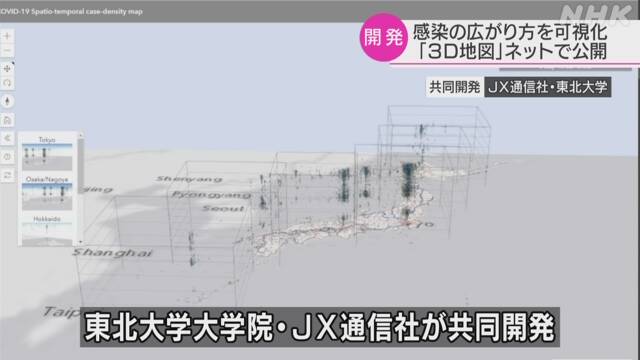
A group such as Tohoku University has developed a map that allows you to see the spread of the new coronavirus infection in Japan in 3D in chronological order and published it on the Internet.
It was jointly developed by Professor Tomoki Nakatani of the Graduate School of Environmental Sciences, Tohoku University and a group of JX Press Corporation, and published on the website.
Based on the information on people infected with the new coronavirus announced by companies and hospitals after February, the areas where infection was reported in chronological order will be displayed in three dimensions on the map. If there is a lot of information on infection in one area, it is color-coded into red, blue, and gray according to the infection density and the length of the period, such as red.
Especially in urban areas, many infections have been reported over a long period of time, so it is displayed as a cloud pillar on the map.
According to the group, it has become a "core of infection" that continuously infects in metropolitan areas such as Tokyo and Osaka, and then it is visually recognizable that it has spread to the surrounding area. It helps to understand how the infection spreads.
Professor Nakatani, who developed it, said, "Initially, it was pointed out that the infection was spreading from central Tokyo and Shinjuku, but now small" nuclei "have been born in local cities. I want you to recognize that there is something close to you and use it as an opportunity to think about your actions. "