
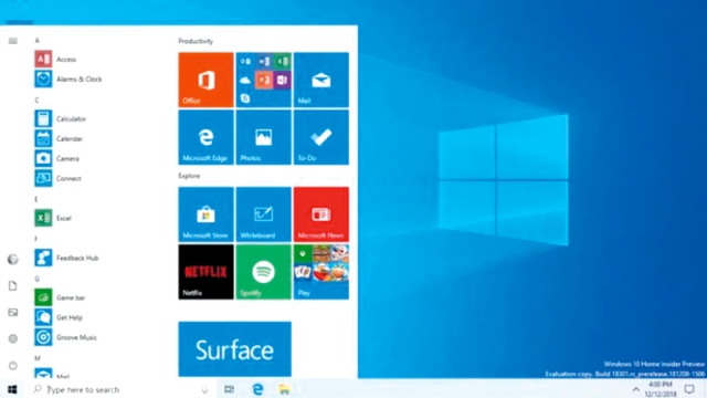
For more than a quarter of a century, specifically with the launch of the Windows 95 operating system in the mid-1990s, hundreds of millions of computer users around the world have known and coexist with the "Start" key in Windows systems, which leads them to a set of commands and functions, which They appear in the form of small vertical "tiles", which are called "Start" menu. Throughout these years, it has remained an outlet from which the user draws to the operating system taps, orders and details, its applications, programs and tools, and it seems that the time has come for this list to retire with its old appearance. Microsoft announced that it is preparing the square for a new Start menu that appears in front of The user is in the form of an open flat window, with "contiguous icons" inside it, not a vertical bar that includes tiles stacked under each other.
And revealed «Microsoft» about this change in a blog post on the official blog «Windows» blogs.windows.com, accompanied by a short video, in which some features of the new “Start” menu appear, and said that it is currently being presented to members of the “first insiders” program, in preparation for For official launch later.
Dual screens
The network «zdnet.com» specialized in technology, quoted informed sources inside «Microsoft», saying that the decision to change the appearance of the Start menu and its historical shape, as it is one of the pillars of the main interfaces with «Windows», came in response to two things, The first: challenges and changes imposed by the nature of new generations of computers, especially those operating with dual screens, and collapsible screens, among them the "Microsoft Service" computer from "Microsoft" operating on the dual screen, new tablets and others. The second reason: the great diversity in the environment of new devices, in which mobile phones and tablets have entered a key factor, and in its entirety constitute an extension of traditional working environments, within institutions and companies, and even at the level of the individual user. This change in the environment of new devices brought new operating systems with it to the workplace and productivity, which represents the main arena for operating systems «Windows», in the forefront of which are «Android» and «iOS», and «Chrome Book», and others. In the published post, the main design director of Microsoft's creative director, Christina Cohen, talked about how computers have changed and evolved over the past 35 years, and she has reflected herself on symbol designs and different interfaces with the computer, including interfaces and major user experiences , Such as the Start menu. Cohen defended the idea of "contiguous symbols" in a flat window, saying that monochrome symbols look great in the context of colored tiles stacked vertically inside the current Start menu, but as more icon patterns enter the ecosystem, this approach must evolve, because When the icons and icons in the taskbar and the Start menu are different patterns, they create a greater perceptual burden to scan and search applications, and from here it is necessary to resort to something different, and through study and observation, it was found that the idea of “contiguous icons” horizontally in a flat window appears to be a better and more option Smooth, easy, and check Zaida consistency and compatibility, both with double folding screens, or between different operating systems on the scene.
Symbols between 100
And according to what "Microsoft" reported, the new change that will occur in "Start" will make it include a set of new "icons", which come within more than 100 new symbols, which will be implemented in the new and upcoming Windows 10 systems, especially the operating ones. In the release of Windows 10X, which is devoted to tablets and dual-screen or folding computers, then finds its way into the usual laptop and desktop computers.
And many leaks have appeared during the last period, about the nature of new icons and icons in "Windows 10", unlike what Microsoft revealed officially at the end of December, and it started with new icons for mail, calendar, hour, alerts, and calculator applications, all of which were prepared for official launch with an update Upcoming Windows 10, named Bild 19569-1000.
The new concept
One of the members of the "Windows Insider" team at Microsoft, Brandon Leblans, was keen to confirm that the new concept does not mean that the idea of "live tiles" vertically stacked in "Start" will disappear, but will remain, and the new concept relates to a future release that helps implement the idea The "seamless design", which makes it the basis for the work of "Windows", because it aims to create a consistent entry point to applications for "Windows", "Linux", "Android" and "iOS" together.