
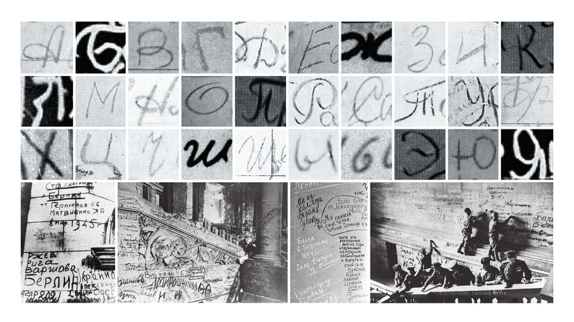
The real symbols drawn by the hands of Soviet soldiers 75 years ago became the prototype of each letter.
“May Victory Font” is a kind of living graphic monument to veterans. But we want to believe that in these letters that came to life, we also have a reminder at what price the victory was won. Remembering and knowing through what hell, pain and suffering the world went through in the middle of the twentieth century, we, the young generation, the heirs of that Victory, must do everything so that people will never again know what world war is, ”said Kirill Karnovich-Valois , author of the project idea.
Each letter has several alternative forms, and the letters themselves are arranged in the lines a little unevenly, which reflects the naturalness of the handwriting of the words on the wall.
“In large size, the texture is clearly visible, as if the letters were written on a rough surface. In the small size, the texture is barely noticeable; only a slight softness of the set remains from it. We managed to achieve this effect by writing an algorithm that modified the outline of letters. He not only mechanically deformed it and made it “torn”, but allowed to emphasize the lively and natural sensation that is created thanks to the font, ”explained the Contrast Foundry design studio, which created the May font.
With the font “May” RT opens its large-scale project dedicated to the upcoming 75th anniversary of the victory of the USSR in the Great Patriotic War - #P Victory Pages. The creators of # 1917LIVE and # Romanovs100 will consider the history of the Great Patriotic War through the prism of social media and digital art. The main part of the project will be launched in January 2020. Follow the # Victory Pages on YouTube, VK, YouTube, Instagram and Twitter.