
Frölunda meddelade 2020 att de skrotar indianen i sin logga. När de presenterade det nya klubbmärket i onsdags möttes det av stor kritik. Under fredagen kallade ishockeyklubben till presskonferens där de skulle ”räta ut en del frågetecken” efter att de lanserat den nya loggan. Nu har de meddelat att de drar tillbaka den nya loggan.
Förutom att den nya loggan liknade en rad andra redan existerande logotyper så har den kritiserats för sitt utseende – och har liknats med en svastika.
- We could not in any way see that one could weigh in associations to the 30s.
None of us saw it, says Frölunda's chairman Mats Grauers at a press conference
Grauers says that he has been in contact with representatives of Frida Hansdotter's company but not of the Property Owners, who both have a similar logo.
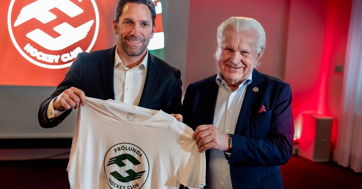
The work of finding a new club brand is put on hold until further notice.
Grauers regretted during a press conference that they did not involve the members of the association well enough during the whole process of developing a new club brand.
- The members have priority of interpretation.
we made a misjudgment not to see to it, he says.
The text is updated