
At the start of the new season of the Russian Premier League (RPL), an unexpected scandal threatens to erupt. Representatives of the Canadian rugby club Toronto Wolfpack, which played in the prestigious Super League, intend to find out how it came about that the new emblem of Tambov is similar to their logo.
“We found out about this yesterday, and of course we are very concerned about the similarity to our logo. We will urgently consider the legality of such use, "- quotes the words of the representatives of the Sport24 club.
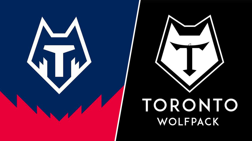
The presentation of the new Tambov logo took place on 6 August. It still has one of the unofficial symbols of the city - a wolf, but now its image is more schematic. It is made in white and blue.
Not only professional designers, but also representatives of Tambov took part in the development of the emblem. It is reported that the minimalist style was not chosen by chance: firstly, it corresponds to modern trends, and secondly, it will look favorably against the background of more traditional logos of other teams.
Unlike the previous symbol, which existed for only one season, the new design was to the liking of many fans. Although there were those to whom he reminded of the Wolverhampton team of the English Premier League (EPL), whose symbol is also the wolf, and even the National Football League (FNL) club Chertanovo.
More attentive users of social networks recalled the rugby "Toronto Wolfpack". In their opinion, the similarity of the logos is given not only by the white schematic image of the wolf, but also by the letter "T" in the middle.
The next day, a post appeared on the Toronto Wolfpack Twitter page in which the appearance of a similar badge of the Russian football club was jokingly linked to a difficult year for the whole world in 2020. It is worth noting that some fans of the Canadian team did not agree with the hint of plagiarism, but, on the contrary, called on its leadership to solve their own problems. The fact is that at the moment the team is in a difficult financial situation, which forced it to withdraw from the Super League this season. The players are not getting paid and the club has been put up for sale.
Sigh, 2020 ... https://t.co/4gZ0tkEIVS
- Toronto Wolfpack (@TOwolfpack) August 7, 2020In "Tambov" itself, they rejected accusations of plagiarism. According to the team's sports director Pavel Khudyakov, the club just wanted to start a new RPL season with new symbols.
“This issue was dealt with by our PR-service, but we definitely didn't copy it from anyone, it's 100%. And the fact that it looks like the emblem of the Canadian team ... It also looks like the logo of the English football club Wolverhampton, so there is nothing to comment on, "Khudyakov explained.
The design company also recognized the similarity of the drawings. Its art director Mikhail Antipin said that he personally supervised the process, and said that the developers had many options, so there could be no question of borrowing someone else's idea.
“I myself followed the whole process of creating a new logo for Tambov and saw how the logo changed step by step. If you look at our numerous options, it becomes clear that we did not steal anything, there is no plagiarism. This happens when you step on the road of minimalism. There are a lot of coincidences, we often come across this. Unfortunately, such situations often happen, but nothing critical. Our logo is slightly different in style. Yes, the design and layout are similar to Toronto, there are such intersections, ”Antipin said in a comment to Sport24.
In addition, he said that the designers initially started from the first letter in the name of the city and, accordingly, the team.
“The second symbol, of course, was the wolf. The bee, also one of the symbols of Tambov, was a fallback. We tried to integrate a bee and a wolf, in principle it is a similar idea. The very shape of the pentagon is the ball bar, it's just football. It just so happened that they are similar, so I don’t see any problem in general, ”added Antipin.
It should be noted that minimalism is really popular among Russian teams. Before the start of the season, FNL teams “Chaika”, “Akron”, “Veles” and representatives of the PFL championship “Olymp-Dolgoprudny” changed their emblems to more simplified ones.
Suspicions of plagiarism are not uncommon in football. So, two years ago, it fell to the designers who were rebranding the RPL. Some social media users accused them of stealing an idea from a Moscow barbershop. The case did not go to court, and the white-blue-red bear still adorns the emblem of the country's top football division.