
On Wednesday, it was time for a new attempt - at a members' meeting at a hotel in Gothenburg, Frölunda's new club brand was voted out.
This time, however, they had included the fans in the process and developed three alternatives that the members of the club agreed on in advance.
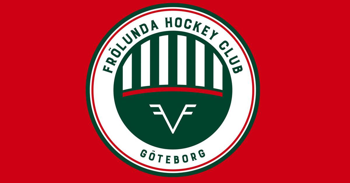
The three alternatives had been selected from just over 800 proposals and on Wednesday the final winner was announced.
The same symbol since 1995
Since 1995, Frölunda has had its current symbol.
In the autumn of 2020, they went out with the logo to be replaced.
But when the new logo was presented at a press conference under pomp and circumstance in February, the reception was not what was expected.
Accused of plagiarism
Instead of cheering, the fans raged.
Criticism was directed, among other things, at the fact that it was too similar to the logos of other brands and some even drew parallels to Nazi Germany in the language of form.
The logo was quickly withdrawn and they did again and - judging by today's reactions - did the right thing.