
- Essay.The secrets of 'Chromorama': why when we imagine a pencil we see it yellow?
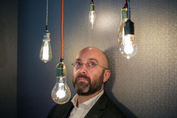
Riccardo Falcinelli (Rome, 1973), Professor of Psychology of Perception at the Isia Roma Design School and graphic designer, in his fascinating book Cromorama analyzes how color transforms our worldview.
Is color a cultural issue or does it depend on the sensitivity of each one? Both. Color, from the point of view of communication - understanding fashion and behavior as such - is a cultural convention. And that explains why according to which countries and according to historical times change the colors we consider beautiful, which we consider elegant. The former director of Vogue in New York said that in Europe the elegant color is dark blue, dark blue, while in India it is fuchsia, magenta. Each country has its standards regarding color, its rules, so in that respect the perception of color depends on the culture in which we are immersed. And that culture can sometimes be very violent. What do you mean? The idea that boys should go in blue and girls in pink is working among young children. Hasn't it always been that way? No, not at all. 100 years ago it was the other way around. In the 19th century, the blue sky was the color of the Virgin's mantle, so the girls went blue like the Virgin. And the children went pink because red was the color of war, of the god Mars, and the children were dressed in a more delicate color, pink. In Italy, the tradition persists, for example, that when boys go to the 18-year-old party, to their first party as adults, they wear a pink shirt. It is a piece of that nineteenth-century fashion. And what happened so that today children are dressed in blue and girls in pink? It is difficult to know the answer. I've researched a lot about it and I think a crucial element was the Barbie. The Barbie is the first doll that has the form of a woman, that is her great novelty. Until then, all the dolls looked like newborns, what the girls proposed was that they play to be moms. However, with the Barbie, girls are proposed to play women. The great success of the Barbie I think is not so much the doll itself as the accessories: the dresses that you can put on, the bags, the shoes, the hair bands ... And the distinctive color of the Barbie was pink . The other toy manufacturers, seeing that Barbie was a bestselling doll and seeing that her color was pink, began to make pink things for girls to be able to compete in the same market. In 20 years, all the toys for girls turned pink and the blue ones for boys. I think this may be a reason, but there could be a previous one ... Can you tell me? In the years when the Barbie was launched, the wife of US President Eisenhower presented herself to a cocktail dressed in pink suit. It was very successful, and all American women began to imitate it. The pink stick was not very widespread in this type of garment, cocktails used to go black or red. Using a color like pastel pink was a great novelty. And Mrs. Eisenhower was then the equivalent of an influencer today. I do not exclude that pink became the color of the Barbie because that color had become fashionable among American women. To explain the evolution of the perception of colors in your book you speak of a Virgin preserved in the Liege museum which, throughout history, has been repainted in four different colors ... Yes, they changed color as the era changed. During the fourteenth and early fifteenth centuries in all paintings, especially Italian and Spanish, the Virgin wears black, because she is a mourning mother, she has the child in her arms but knows that he will die on the cross. With the arrival of the Renaissance, those who commissioned paintings wanted to make clear their power, their wealth, and the mantle of the Virgin began to paint blue, because the color blue was very expensive because it was done with lapis lazuli. In the Renaissance, seeing the color blue was like seeing a Louis Vuitton bag today: something that immediately makes you think it cost a lot of money. Today the mark of price is the marks, in the Renaissance it was the color.And in which two other colors repainted that Virgin of the Liege museum? After painting the mantle of that Virgin of blue, in the Baroque they painted it gold . And at the end of the 19th century the mantle is painted white, because with the dogma of the Immaculate Conception decreed in 1854 the Virgin becomes a symbol of purity. That is why, when making first communion, girls wear white. Has the industrial revolution transformed our way of seeing colors? Yes, absolutely. The industrial revolution has made many colors available to us that we didn't have before. Before the industrial revolution people had a very limited and exceptional relationship with color. That is why there are still stones today called precious: they were considered precious not only because they were scarce but also because they had color. There was no plastic, there were no synthetic dyes ... Very colorful things in nature are few. The flowers are colorful, yes, but they dry and do not last long, they soon darken. So for people before the industrial revolution the color was something precious, rare and very desired. And today? Today we can have anything of any color. I give an example: a Lacoste polo shirt costs the same in pink, yellow, green, light blue, navy blue ... In the past, a blue fabric cost 30 times what that same fabric in white. With industrialization all this has become invisible, color is no longer priced. Any object - a plastic cup, a sofa - you can choose the color you want and the price is always the same. There are only a few exceptions, such as cars that, in fact, are somewhat more expensive in some shades. But 200 years ago it was not like that: anything had a very different price depending on the color of what it was made of. And why before was the color determinant in the price of things? Because colors were made with natural substances, and The scarcer these were, the more expensive the colors. The ultramarine blue color, for example, was made with a powder reduction of a semi-precious stone, lapis lazuli. And in the ancient world the only source of that mineral was present-day Afghanistan. All that changes with the industrial revolution. You argue that another of the fundamental changes in our perception of color is the arrival with the industrialization of the flat color, the color that has exactly the same tone at each point of a surface ... That's right . The flat color barely exists in nature, only in the sky and in some flowers. But the industrial revolution has allowed the emergence of the flat color, that the surfaces could be painted in a compact way with a homogeneous color, always the same. Today we are used to flat color. The funny thing is that, as always happens when we get used to one thing, now the opposite is desired. What do you mean? Today we live in a very synthetic, digital and plastic world in which flat color is the norm. So we have begun to desire things that have no flat color: melange fabrics that combine various colors or shades, or sponge-painted walls in various shades ... Today we like things a bit imperfect. If one goes to the supermarket, he realizes, for example, that industrial foods use flat color in their containers, while the containers of organic products are brown, a bit velvety, a bit grainy, like the old papers that were used To wrap the bread There is a desire today to use colors that have a natural, organic appearance, and there is also a resurgence of 'old colors', of pastel colors, for example. Don't you think so? Yes, yes. That is due to the success of the vintage. You want things that have a patina, that look like living things, that are not new. Those things are perceived as more refined. Although many of those things are then produced in series. Really artisanal things are very expensive. Another important change is that industrial colors barely age, they remain the same for a long time ... Yes. A piece of red Lego, for example, keeps exactly the same color as it was 40 years ago. The color in the plastic ages a little. But, as I said at the beginning, now an aging color can be considered more refined, more sophisticated, precisely because we are invaded by plastic products whose colors barely change over time. The omnipresence of the single color today, has it modified our way of thinking or seeing colors? I think so. And I think it has also modified the way we make assessments. One of the consequences of the unique color is that things today seem to us to age very quickly. Before, a piece of furniture could be in a family 400 years. Today a piece of furniture, as soon as it starts to break down or lose color, it seems immediately old. A white-painted wall of an office begins to get dirty and must be repainted at approximately two, three years. In homes, at most it is usually painted at 10 years, and the date is delayed because it is a heaviness to do so. But in the nineteenth century that perception did not exist. The entire walls lasted 30, 40 years. Everything was very slow, the sense of the aging of things was very different. For me, the unique and uniform color is an image of speed. Two thirds of the pencils produced and sold on the planet are yellow. Why? For everyone, at least in the West, the yellow varnished pen is perceived as the quintessential pen. It happens to us with many things, but in the case of the yellow pen it is exemplary: so much a pen is identified with the yellow color that an experiment was made in which it gave people identical pencils, some yellow and others green, and most He said yellow pencils wrote better. The color conditioning is incredible, absolutely incredible. I give another example: they did an experiment in the laboratory, they made a Coca-Cola with exactly the same flavor as Coca-Cola but orange, and the people who tasted it said it was Fanta, not to mention the suitcases ... Yes , is another very funny test: two identical Samsonite suitcases, one white and one black, with exactly the same weight. Well, people said that black weighed more. But the most incredible thing is that the participants in that experiment were placed electrodes to measure their level of effort and, indeed, people got more tired and sweated more when they took the black suitcase, even though it weighed the same as the white one. And how do you explain that? We are used to making black things generally heavier. So, just by seeing black, the brain prepares the muscular system to make a greater effort, so when taking a black suitcase, a greater muscular effort is made than when taking a white one that weighs the same. Are there colors whose meaning has not changed over time? No, all colors have changed over time. But there are colors whose meaning lasts very very long times. For example: that dark things are heavier than light ones, that bright colors are positive and dark negatives are things that come from far away. But they also have their nuances. For us today it is normal to wear dark at a funeral, but in the 19th century that also meant luxury, because dyeing a garment in dark black was very, very expensive. And in the nineteenth century, poor people went to funerals in the best outfit they had, even if it was colored. You argue that blue is not a cold color ... Can you explain it to me? In the Middle Ages, blue was considered a color close to red, because they are both vivid, strong, and both were considered hot. However, today we consider that a color is hot if it approximates the color of the fire. That has made us consider green and blue, closer to ice, as cold colors, and red, yellow and orange hot. But in part that belief is based on the fact that we see this type of association very frequently, to the point that they end up looking natural. When they give for example the weather forecast, the bad weather, the cold, it is blue and the good weather, the heat, red. By dint of seeing that, we consider it to be natural. However, physics says the opposite: if I take a piece of iron and heat it, it turns red hot, but if I keep heating it, it turns blue. And the flame of the gas we cook with is also blue. But we do not make such associations, we often think of colors as standard categories. Really, as you say in "Chromorama", in the rainbow there is no red color? They taught me something else at school ... Red is not in the rainbow. What there is is a very, very charged orange that in Newton's time was considered a type of red, and in fact it is. But in the rainbow there is the red Coca-Cola, to understand us. Since Newton's time it is taken for granted that all colors are in the rainbow, but recent science has shown that red-red, poppy or Coca-Cola, does not exist in the chromatic spectrum. Childish belief that you shatter: it says that it is not true that if you mix yellow and blue you get green ... Yes, that is an industry invention. Today we take it for granted that if we mix blue and yellow we get green because with industrial colors this is the case. But in ancient times, before the fifteenth century, it was forbidden to mix colors and also, if it was done, a very different result could be obtained than desired. Cennino Cennini, a 14th century painter, from the Giotto era, and who also wrote one of the first art treaties in Europe tells for example that you cannot mix green and white to get a lighter green, because in the green is copper and the white lead, and if those two substances react the result is black. For a medieval child, if white was added to white, the result was black. For us today everything is regular, the colors we buy are industrial and are made to behave "well" and always in the same way. Neurologists argue that our brain first perceives the color that forms ... That's right. Recent studies, of the last 20, 30 years, confirm this. It is a matter of an instant, of milliseconds, but our brain effectively captures color before form. But it is easier if I explain it to you with an example: imagine that while you are talking to me and looking at me, something starts to appear on the side, I am able to say what color it is before saying what it is. It is fascinating. Is communication in its broadest sense - cinema, advertising, comics, television, magazines and newspapers, etc. - what creates our idea of colors? Yes. Mass media play a fundamental role in building the associations we make with colors. Is there a more accepted color, more successful than others? No, we use all colors to say all things. But in the West, from an industrial point of view, white is the most produced color. 80% of pigments produced in the West are white, it is the most purchased color of all. Even in clothing and, of course, in wall painting. But that doesn't mean I can't change ... What do we still not know about colors and would like to know? No one has yet been able to explain what the real mechanism is why he changes fashion with respect to colors. In this book, I tell you historically why things have changed with respect to colors, but doing so last year is easy. No one has come up with a model that explains why our perception of colors changes, because some colors we liked and suddenly stopped liking and others still like us. Globalization, is it causing colors to have the same meaning in Everyone? Yes, but very slowly. In the east the colors still have very different meanings to those we attribute to them in the west. I told my students to design the covers of a love novel and a horror novel. And a Chinese student explained to me that in her country passionate love, sexual love, is white, a color that symbolizes purity for us. For us, passion is red or even black: the cover of "Fifty Shades of Gray", for example, was black all over the world.According to the criteria of The Trust Project
Know more- Final Interview
- Art
THE FINALE INTERVIEWike Schmidt: "Queues at museums are an invitation to terrorists"
ArteGauguin, an artistic drama in Trafalgar Square
The Paper Sphere Marc Quinn: "My blood, your blood and the blood of a refugee are the same color"