
The Apple logo is one of the most famous logos in the world.
Not only do Apple fans put this logo on their cars to show their loyalty, they go to great lengths to tattoo it on their bodies, a level of loyalty that very few brands achieve.
Logo Origin
There are many theories about this logo and to find out the truth, we must return to the interview with Rob Janoff, the designer of the original Apple logo, who will tell you all about its design.
In January 1977, Janov's advertising agency, Regis McKenna, acquired the rights to a redesign of the Apple logo, which was to be launched with the company's new product, the Apple II computer, in April. April of the same year.
Janoff has met Steve Jobs, Steve Wozniak and Mike Markula.
He was a friend of the CEO of Reggs McKenna, and Steve Jobs asked Rob something and said, "Don't make it nice."
The previous Apple logo was showing Sir Isaac Newton sitting under an apple tree (communication sites)
Previous logo
“There was an earlier slogan to mine,” Janoff says in the interview. “It was a slogan done by Ron Wayne who was a very short-term partner of Steve at the start of the company, selling his stake later, because he was a little worried about the financial obligations he might have.”
Janoff painted Sir Isaac Newton sitting under an apple tree.
And I think when Steve Jobs started taking his computer products seriously, he realized that the logo wouldn't be appropriate to put it on.
So he needed a new logo.
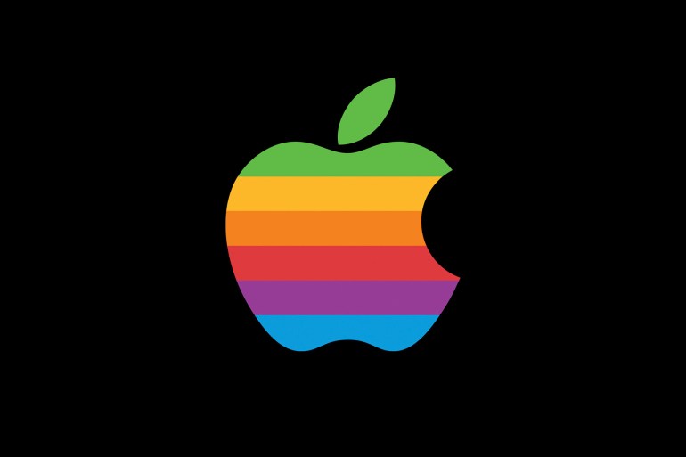
color strips
"We presented two versions of the logo. One with a bite and one without, and Steve chose the version with the bite, and when I showed it to him there was a striped version, and a solid-color version, which is a metallic version."
The real reason behind the lines is that the Apple computer was the first home or personal computer that could reproduce images on the screen in color.
So it represents colored bars on the screen.
Also, it was an attempt to make the logo accessible to everyone, especially to young people so that Steve could introduce the device to schools.
At the time, most logos were one or two colors, and Janoff says Steve liked the idea, because he liked the ideas that were out of the box.
It's not revolutionary now, but it was a little different back then.
However, Rob Janoff received a lot of opposition from one of the agency's account executives.
This manager made the comment that if this new company went ahead and produced stationery in all these colors, it would go bankrupt before it even started.
The real reason behind the color lines is that the Apple computer was the first computer that could reproduce images on the screen in color (communication sites)
What does the bite represent?
What does the bite of an apple represent?
Is it a reference to the computer term "byte"?
Or is it a reference to the incident in the Bible when Eve bit the forbidden fruit?
Does the fruit itself refer to the discovery of gravity by Newton when an apple fell on his head while he was sitting under a tree?
Janov says - in the interview - that all of these ideas are interesting, but they had nothing to do with the bite, I designed it with a bite for size based on the desire of Steve Jobs, so that people would realize that it was an apple and not a cherry or any other similar type of fruit.
It was also a request for a computer test.
Something everyone can try.
"If anyone ever had an apple they would probably have bitten off and that's what you get. After I designed it my creative director told me 'Well you know, there's a computer term called byte.'
I couldn't believe this coincidence, so it was like a complete logo, but it was a coincidence that I didn't know at the time that byte was a computer term."
The Apple logo is admired for its simplicity and the many meanings people share about it.
It is valid for all times.
For 30 years it has not changed, and it can remain for a long time before any radical change is made to it.
And whether you're an Apple fan or not, you can't deny that this design has taken the biggest chunk of the tech market in the last two decades.